

The colours you choose to paint your cafe, shop or office are far from a surface-level decision. In fact, the colour scheme of the interior and exterior of your business can deeply affect your employees’ productivity and mood and influence how customers perceive your brand. So, let’s look at how exactly you can utilise the science of colour psychology in commercial painting.
Colour psychology is a field that explores how colours can impact our behaviour, emotions, and perceptions.
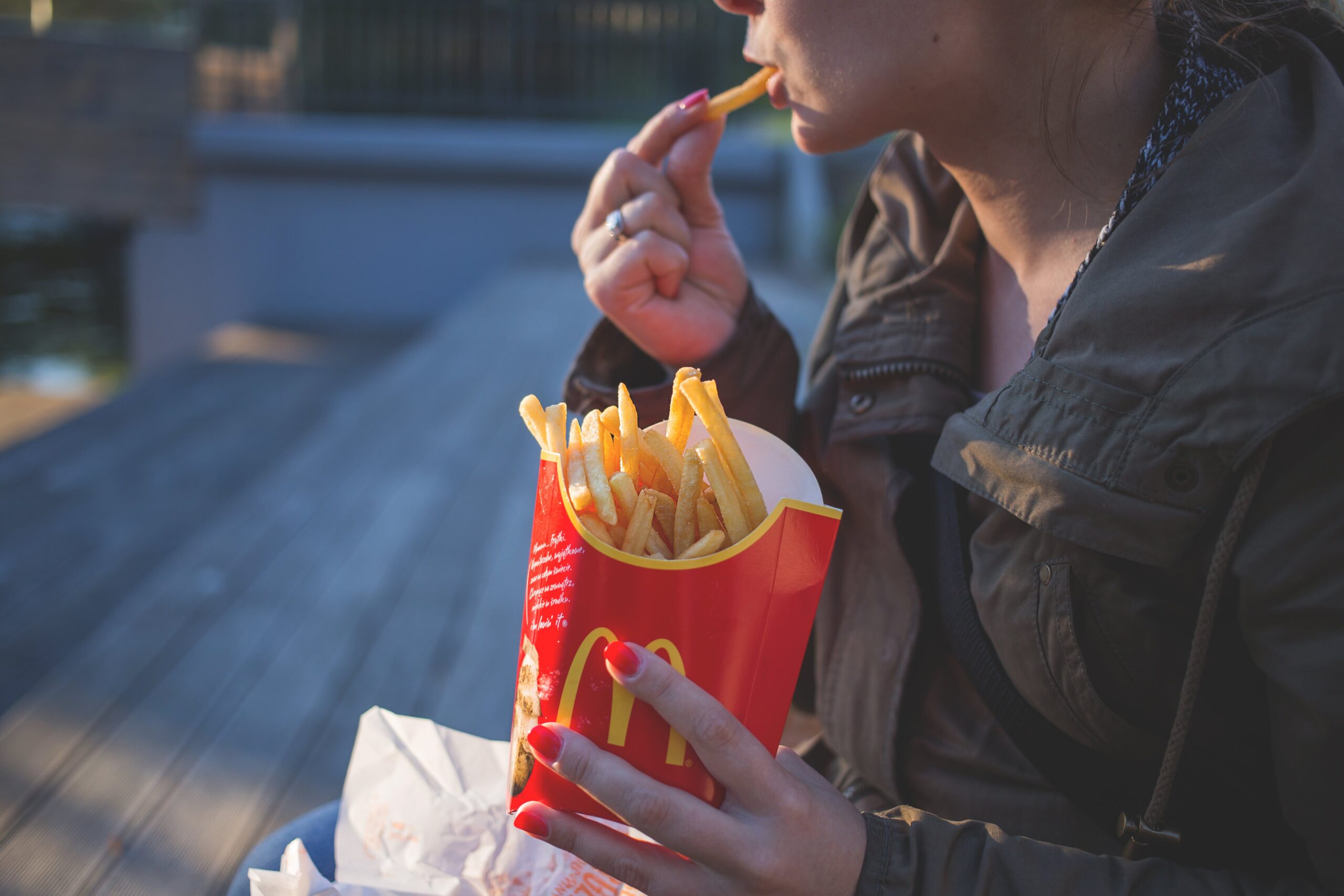
Did you know, each colour can subtly impact a person’s mood without them even knowing? Take red, for example, a vibrant and bold colour that can quicken the heartbeat and stimulate appetite. It’s no coincidence that many fast-food chains use red in their branding. On the other end of the spectrum, we have blue—a serene and tranquil colour. It can induce feelings of calm and trust, which is why it’s a popular choice for businesses such as banks and healthcare providers.
In the context of commercial painting, understanding colour psychology can be a game-changer. It can help businesses create an environment that aligns with their brand’s identity and enhances the desired customer experience. Imagine walking into a day spa and being greeted by a vibrant red wall—it’s jarring and contradicts the essence of a spa: relaxation and tranquillity. On the other hand, a soft lavender or cool blue can instantly create a calming ambience, setting the tone for an experience to match.
However, the application of colour psychology requires careful consideration. You’re not merely choosing a colour because it’s your favourite or because it matches your logo. You need to consider the nature of your business, your target audience, and the kind of emotional response you want to elicit. It’s a delicate balancing act, and getting it right can elevate your customer experience to new heights.
Looking for commercial painters in Clayton or Keysborough? RESOLUTE Painting & Projects provides colour-matched and accurate painting services to businesses in a range of industries.
Colours are more than pretty to look at. Colours strategically evoke emotions, influence behaviour, and shape perceptions. Let’s look at different colour choices to better understand their psychological effects and potential business applications.
Red is synonymous with passion, energy, and stimulation. Businesses looking to cultivate an atmosphere of urgency, excitement, and high energy often gravitate towards this vibrant hue. Think about the bustling environment of a fast-food restaurant, a dynamic tech start-up, or a high-intensity gym. The colour red can be instrumental in instigating a sense of immediacy and enthusiasm. However, as a word of caution, an overuse of red can also trigger feelings of aggression or stress.
Commercial businesses that use red include fast food store, gyms and sports stores.
Blue symbolises trust, calm, and stability. It’s a colour that is often associated with reliability and serenity, making it a popular choice among businesses that aim to foster a sense of trust and consistency. From healthcare providers to financial institutions, blue can evoke a sense of security and tranquillity. However, the overuse of blue can potentially convey a sense of coldness, so it’s essential to balance it with warmer hues or neutrals to maintain a welcoming ambience.
Commercial businesses that use blue include banks, hospitals and luxury services like spas or hair salons.
Green’s association with nature, growth, health, and tranquillity makes it an excellent choice for businesses in the health and wellness sector. For organic food stores to restaurants serving healthy food, the colour green can create a peaceful and soothing environment that resonates with the ethos of these businesses. The wrong shade of green can evoke feelings of jealousy or sickness, so choosing a shade that aligns with the desired psychological response is critical.
Commercial businesses that use green include landscaping, florists and health food stores.
Yellow is often associated with happiness, optimism, and creativity. It can be a potent colour to foster a positive, uplifting atmosphere. Creative agencies, children’s stores, or any business wanting to stimulate creativity or provide a cheerful experience can benefit from splashes of yellow. But remember that too much yellow can cause frustration or anxiety, so moderation is key.
Commercial businesses that use yellow include toy shops, galleries and graphic design studios.
Of course, the service your business provides plays a pivotal role in colour selection. But there are some other considerations to make in order to help you find the most suitable colour palette.
Understanding your target audience’s preferences is crucial. For example, a tech startup aiming to attract a younger, more innovative audience might opt for modern, fresh colours like teal or lime green. Conversely, a law firm targeting high-profile clients might prefer the stability and trust associated with deeper, more conservative colours like navy or burgundy.
Colour perception can change depending on lighting conditions, the size of the space, and surrounding colours. A small room painted in a very dark colour might feel oppressive, while a large one in a very light hue might feel cold and impersonal.
Lastly, don’t forget the practical aspects. Dark colours hide dirt and stains better than lighter ones, which could be crucial for businesses like restaurants or kindergartens.
It’s important to strike a balance. Overusing a certain colour or choosing an overly intense hue might have the opposite effect, causing discomfort or even turning potential customers away. A harmonious colour scheme employing a clever mix of colours could be more effective, considering the 60-30-10 rule. This rule suggests using the dominant colour for 60% of the space, a secondary colour for 30%, and an accent colour for the remaining 10%.
Colour psychology is a crucial aspect of branding and design strategy that many businesses have successfully utilised. Global giants like McDonald’s and Starbucks are the most renowned and successful examples.
McDonald’s, the leading fast-food chain, predominantly uses red and yellow in its logo and restaurants. According to colour psychology, red is a stimulating colour that can increase heart rate and appetite – perfect for a fast food environment. It symbolises passion, energy, and excitement, thereby creating an inviting and vibrant atmosphere. Yellow is associated with happiness and optimism. The colour yellow has been shown to release serotonin, a neurotransmitter linked to feelings of well-being and happiness, in the brain. This combination of red and yellow is not just a happy accident; it’s a strategic decision to create an inviting, stimulating environment that encourages customers to eat and spend.
Starbucks has chosen green as its primary colour. Green is associated with tranquillity, health, and nature, which aligns perfectly with Starbucks’ brand identity. The company’s green logo symbolises freshness, growth, and ethical sourcing – all core values of the Starbucks brand. This choice of colour aids in creating a relaxed and peaceful environment, encouraging customers to unwind with a cup of coffee.
Want to work with commercial painters in Chadstone or Wheelers Hill to develop a plan? RESOLUTE Painting & Projects offers digital colour services, allowing you to visualise your business’s new paint job easily.
Using colour psychology in commercial painting can be a powerful tool for subtly influencing customer behaviour and perception. However, it can lead to unintended consequences if not handled with care. Let’s delve deeper into the common mistakes businesses make when applying colour psychology and how to avoid them.
The first pitfall is choosing colours that don’t align with your brand identity. If your brand’s message is about tranquillity and relaxation, choosing a bright red could lead to cognitive dissonance for your customers.
For example, imagine walking into a spa expecting to relax, only to be met by a glaring red wall. The disconnect between the colour and the expected brand experience could be jarring.
Therefore, businesses should choose colours that mirror their brand ethos. A fitness centre aiming to inspire energy and motivation might opt for bold reds or oranges, while a wellness spa might lean towards calming blues or greens.
Another common mistake is ignoring the colour preferences of your target audience. A business targeting an older, more traditional demographic might not resonate well with neon colours typically favoured by younger audiences.
Finally, businesses often overlook the cultural differences in colour perception. For example, while white is associated with purity and innocence in Western cultures, it symbolises mourning in some Eastern cultures.
When targeting a multicultural audience, it’s crucial to understand these cultural nuances. It can be beneficial to conduct market research or hire a cultural consultant to ensure your colour choices are culturally sensitive and appropriate.
So, the next time you’re choosing a paint colour for your business premises, remember – colour is more than just a decorative element; it’s a powerful psychological tool that can influence how your customers perceive and interact with your brand.
If you’re unsure what kind of colour to choose for your business, reach out to RESOLUTE Painting & Projects. We are commercial painters in Melbourne with nearly 50 years of experience in revamping businesses and other public spaces.
Check out our gallery to see some examples of our latest work. We love chatting with customers to develop a cohesive and effective colour palette, so call us on 1300 366 544 to discuss your business and how we can help